


NO HOT ASHES
An exploration into surreal cigarette advertising.

My interest in old advertising is undoubtedly influenced by the outdated and the prohibited. Tech products such as mobile phones and cassette tapes being billed as groundbreaking advancements for a new age seem antiquated to us now. Cigarettes were first portrayed as aspirational, then, in later years, downright abstractly, and finally banned altogether. Tobacco advertising is too broad a subject to condense into a single post so it’s something I’ll revisit, but I wanted to share the ads that piqued my curiosity to start with.
As a child I was plonked down in front of Formula 1 nearly every weekend and, as a result, the logos of Marlboro and Lucky Strike (soundtracked by the voice of an ever-enthusiastic Murray Walker) were burned into my brain. I think this is the first time I was aware of tobacco advertising - the billboards and the cars covered with the logos of various cigarette brands. I wasn’t interested - I was very much in the market for a scooter or a Badge It (courtesy of long rainy days perusing the Argos catalogue) - but when I think of my first awareness of cigarette branding, Formula 1 is the most obvious. Upon recently discovering magazines where cigarette ads were plastered across pages, I found that feeling of familiarity creeping over me, even though I think I must have been too young to really remember them. Interestingly, in a Government report, ‘Smoking Kills: A White Paper’ published in 1998, the outline to cease all advertising of tobacco products includes insight from a survey showing that “half of all young people believe they have seen a cigarette advert on TV in the last six months despite the fact that it was banned 33 years ago.” The ubiquity of tobacco advertising was such that, through the sponsorship of sporting events, it was as if we had all been watching direct advertisements of cigarettes.
By the time I was old enough to be aware of smoking as an activity that I might engage in, promoting it had already been banned. By 2003, advertising cigarettes in print was outlawed. I grew up on the cusp of being personally unaffected by the 2007 smoking ban - kids smoked outside school (the legal age to buy tobacco was 16 until 2007) and I remember a few of the earliest gigs I ever went to being in hazy, smoke-filled rooms. I am grateful now that smoking indoors was banned by the time I was working in pubs, and that I never had to get on a plane where other passengers were lighting up. Despite this, I feel a strange desire to know what that was like - there is an undeniable romanticism in television and film that makes smoking look cool.
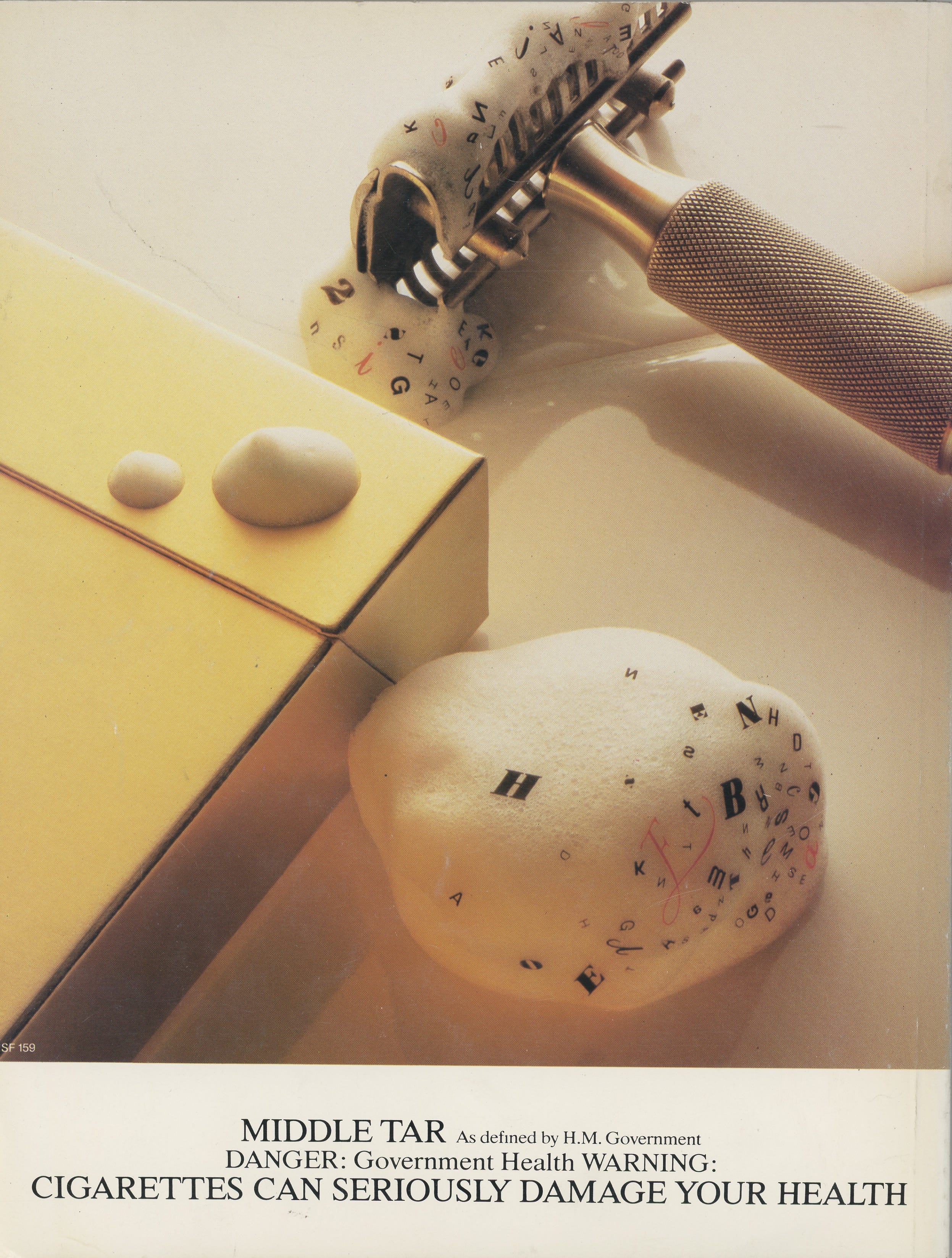
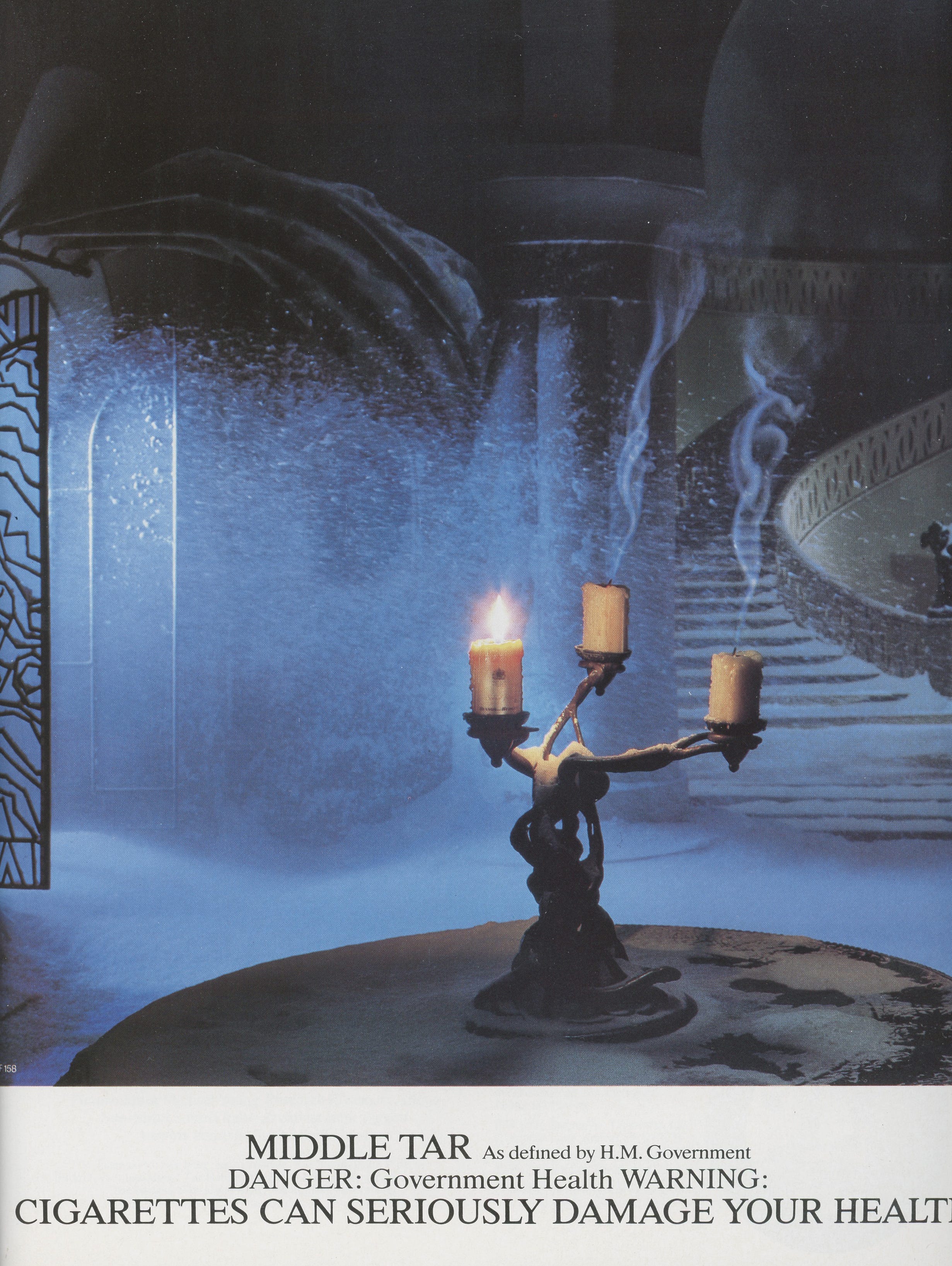
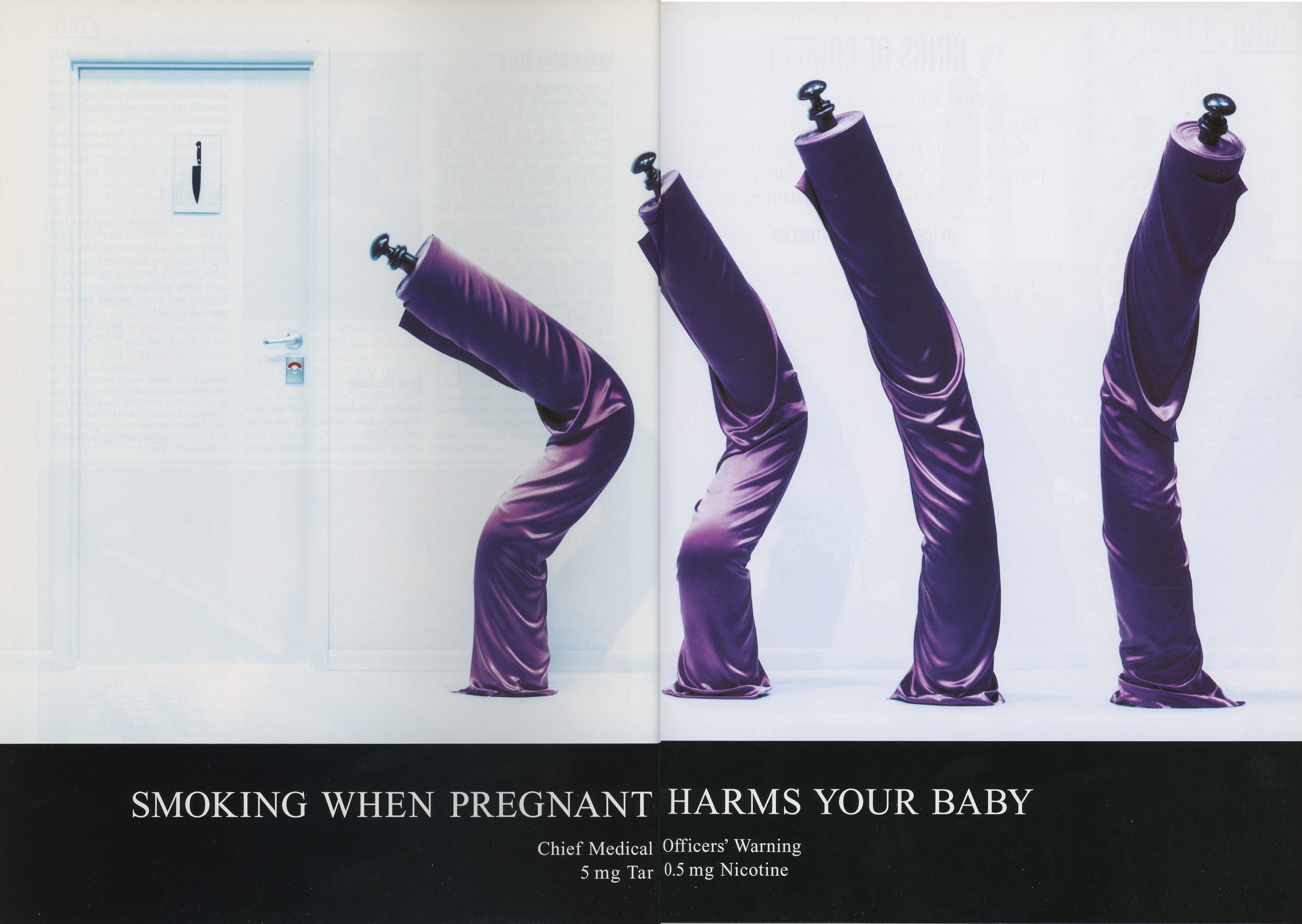
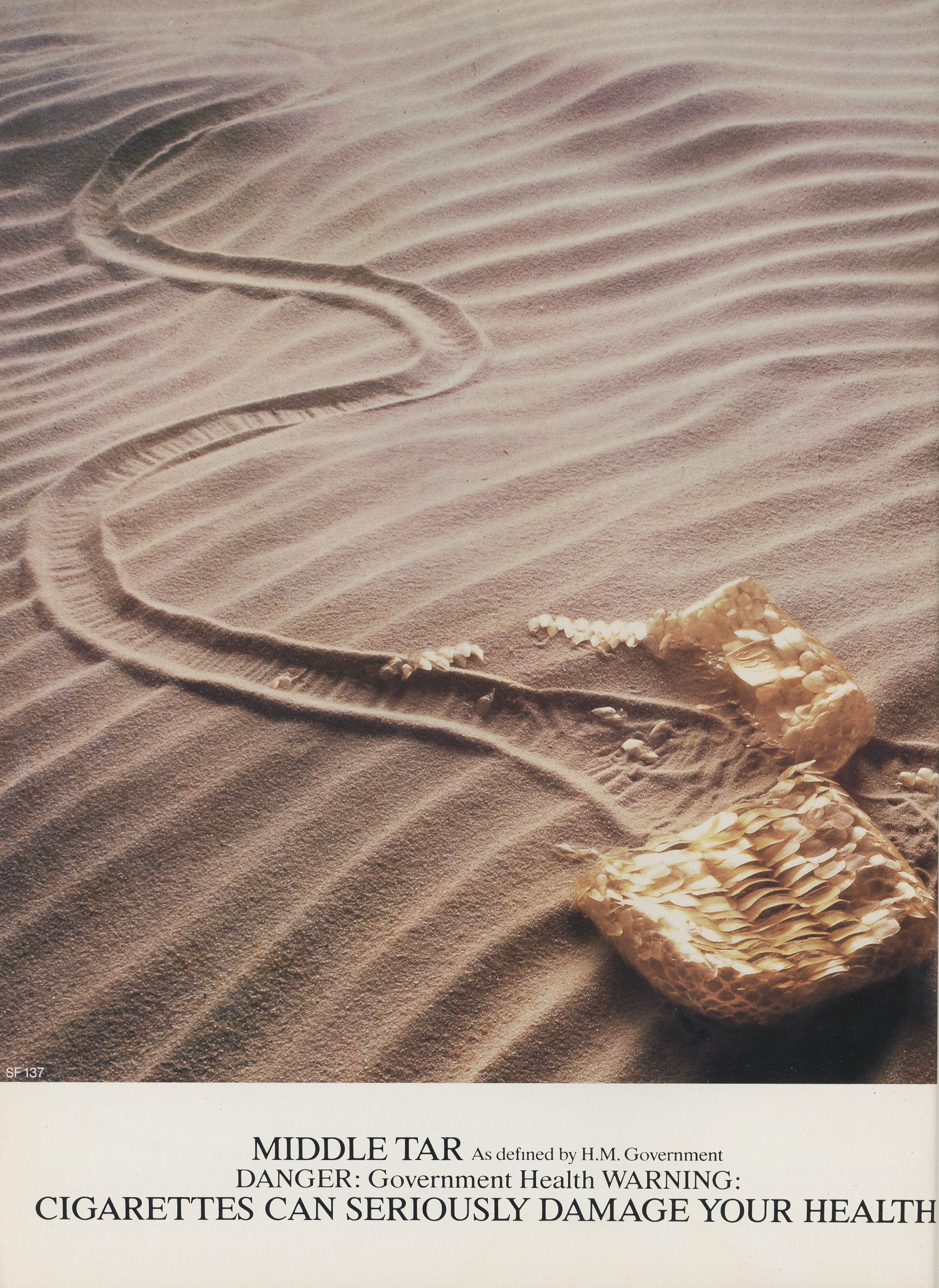
Through various legislative measures since the 1960s, the Government has attempted to weaken these colossal tobacco brands. However, they remain so prominent and, in some cases, still very successful. In 1971, the UK Government ruled that all cigarette packaging and advertising must have a warning stating the threat to health. Several guidelines from the Advertising Standards Agency outlined that adverts should not, amongst other things, show people with cigarettes in their mouths and smoking could not be advertised as aspirational or attractive. Companies and ad agencies had to get creative in response. This led to a number of fascinating abstract advertisements, most notably for Silk Cut and Benson & Hedges.
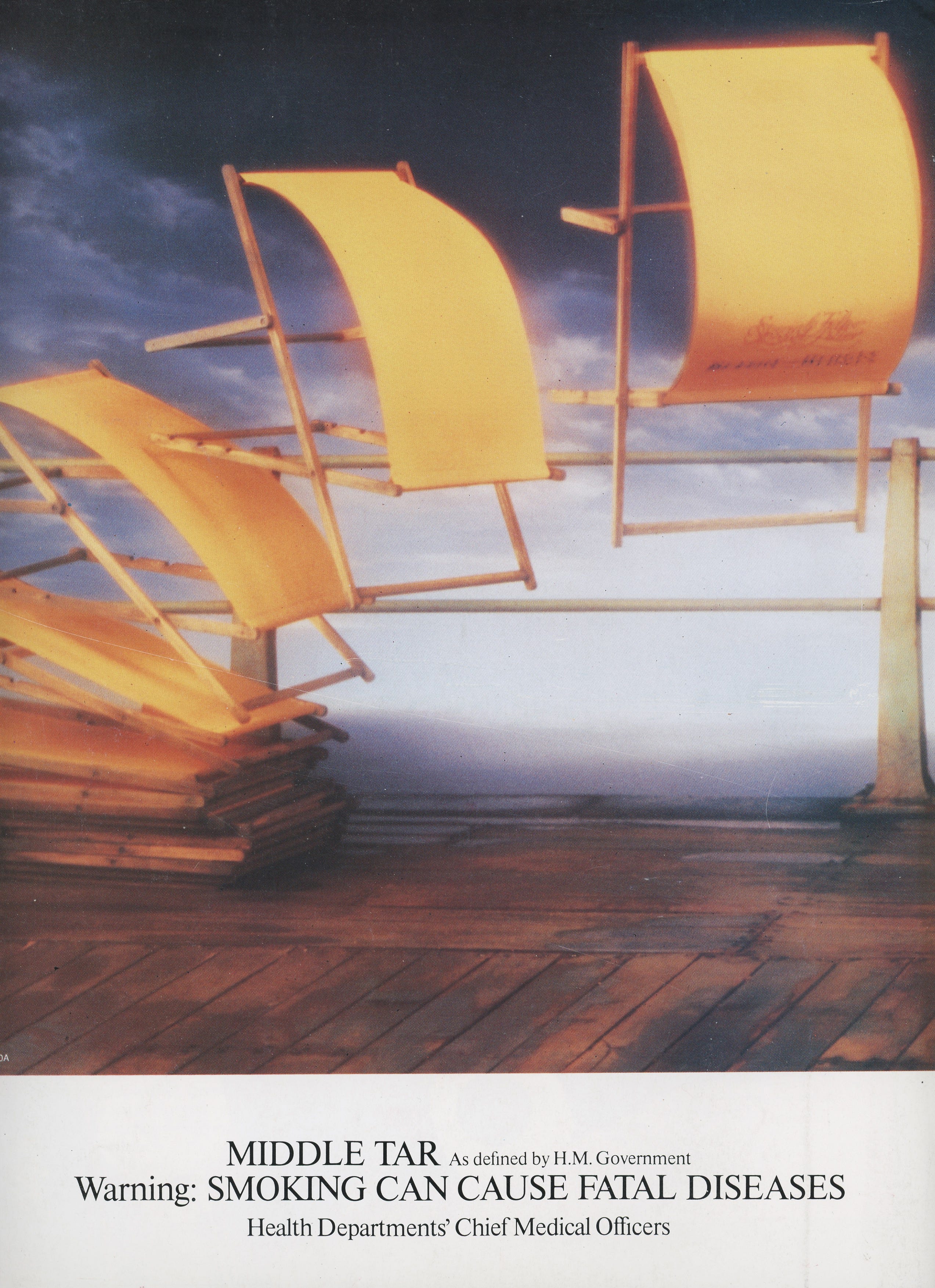
What makes these adverts so unforgettable is the way they draw you in. They incite consideration rather than a glance. Viewers immediately know it’s a cigarette advert thanks to the government-mandated health warning emblazoned across the bottom, but it still invites them to look a little closer. The adverts illustrate the product through art that provokes a double take. For Benson & Hedges, using surreal imagery - employing perspective techniques often created in-camera - became so recognisable that they eventually didn’t even need to show their logo. The gold colouring was enough for consumers to know it was Benson & Hedges. And the smartest part was that these adverts treated the viewer as intelligent whilst adhering to the Government guidelines.
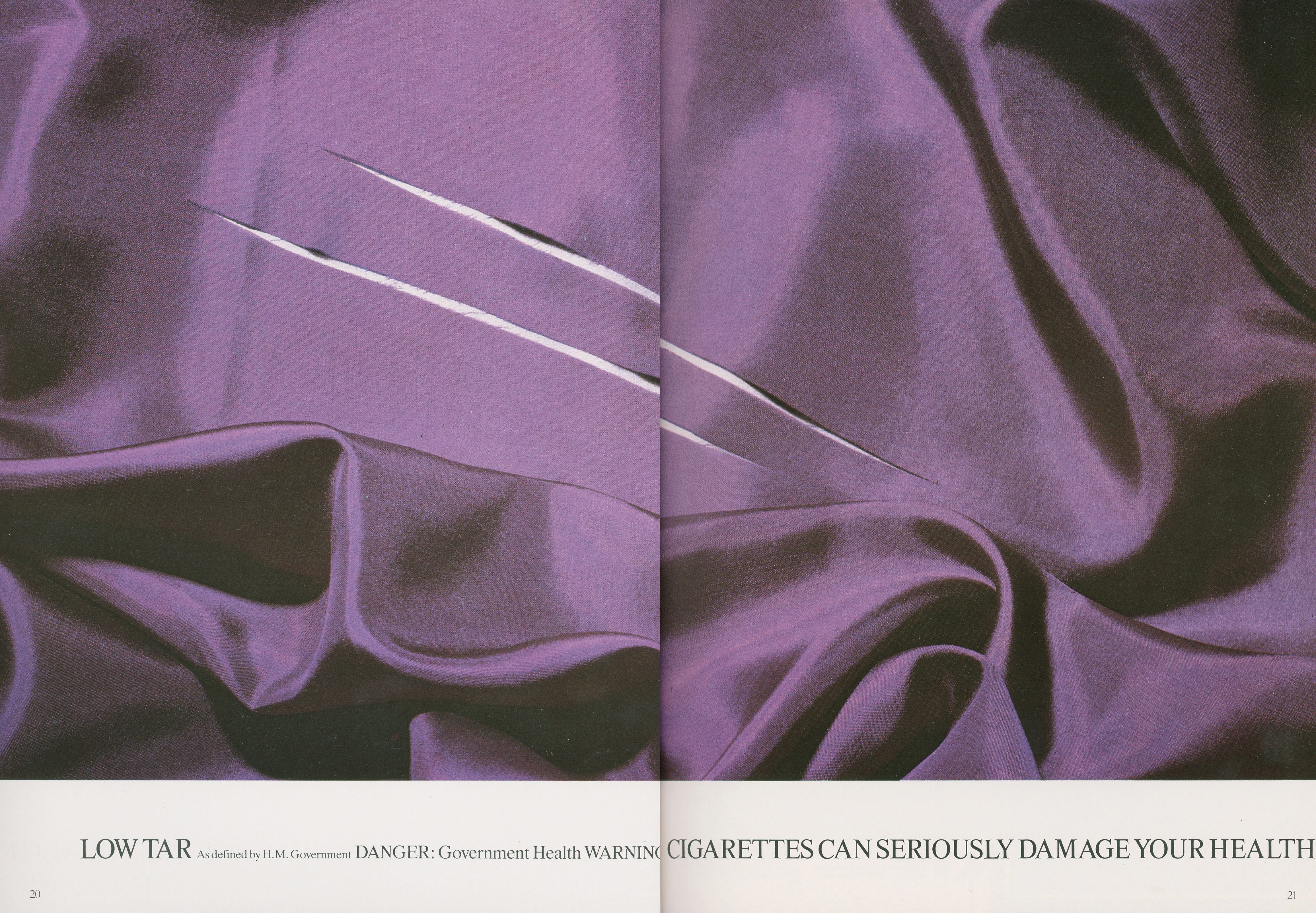
With Silk Cut, the agencies used the most recognisable branding - the purple silk design encasing the packaging - and the literal meaning of the name. Saatchi & Saatchi created many iconic campaigns for the brand that became famous. In a similar vein to the Benson & Hedges adverts, the Silk Cut ads do not depict the logo or the name of the product, instead presenting a visual puzzle to the viewer. Some of the best-remembered are the ‘Dying for a Slash’ advert, the scissors as can-can dancers, and (in the final advert to run before the advertising ban) depicting an opera singer in a purple silk dress split at the seams, a reference to the phrase “it's not over until the fat lady sings”. While many of the campaigns played with pop culture (notably the shower advert referencing the Alfred Hitchcock film Psycho), other adverts have been interpreted as sexual - e.g, the implement doing the ‘cutting’ or ‘slashing’ deemed ‘male’ and the purple silk considered to be ‘female’.
Few adverts capture our attention the way these did - and still do. They are timeless, artistic, surreal and memorable. Above all else, advertising creative should work in this way - rule-breaking and subversive - for consumers to commit both advert and brand to memory, to question social norms and to ‘go viral’ (or whatever the 20th-century equivalent of that was). We see so many adverts, and so many different creatives daily - when was the last time something you scrolled past on Instagram or saw on public transport actually made you take a second look? When did something designed to sell a product challenge, inspire or thrill you?
I’ve enjoyed researching the various archives of ads for this post, I’ll add some links for further reading below.
Hugely nostalgic. Although dark, a level of creative advertising which seemed to disappear shortly afterwards.